Guidelines on how to implement the Cemart visual brand system for cross media applications.
Purpose
Cemart makes the mortars that let professionals build floors and walls that last.
Vision
Stronger buildings with less eco impact. CEMDURE ZERO, the first cement-free screed, is the first step in that innovation.
Values
Rock solid
A good floor is durable, comfortable and safe.
In practiceevery product is tested for strength, every datasheet states layer thickness and use plainly.
Craft
The right material plus skilled hands gives the perfect result.
In practicewe write for the person who lays the floor, and we support them on the job.
Innovation
We develop our own systems and keep moving.
In practicenew products like CEMDURE ZERO come from our own lab, not from a catalogue.
Brand promise
Rock solid, from the bag to the finished floor or wall.
For building professionals who lay, specify or sell floors and walls, Cemart is the Belgian maker of building chemicals and floors that develops and produces its own mortars, from subfloor to design floor, and leads the way with CEMDURE ZERO, the first cement-free screed.
Positioning.
Who for
contractors and screed layers, architects and engineering offices, project developers, and the building trade, in Belgium and abroad.
What
self-levelling screeds and subfloors (CEMDURE), industrial floors (CEMTOP), decorative floors, walls and microtoppings (CEMDECO), and waterproofing for walls and facades.
Why Cemart
a Belgian maker that develops and produces its own mortars, covers the whole floor from subfloor to finish, and brings the first cement-free screed, CEMDURE ZERO.
Personality
Solid
Skilled
Straightforward
Forward-looking
Think of the experienced site manager who knows every product by heart, says it in one sentence, and is already working on what comes next.
CEMART is a wordmark with one orange triangle in the A. Navy wordmark, orange triangle, nothing else. The CA mark carries the same triangle for small spaces. The logo always stands on its own: taglines and product names sit next to it, never inside it.
Core logo.
The full logo leads wherever it fits. The CA mark exists for the spaces where it does not: app icon, favicon, social avatar and small spots on packaging and workwear. When there is room for the full logo, use the full logo. Use the mono versions for one-colour output: black-and-white print, stencils on bags and workwear, engraving.
Primary / Horizontal / On-Light
00
Horizontal / On-Dark
01
No vertical-specific lockup
Vertical / On-Dark
02
Mark / On-Dark
03
Horizontal / Mono On-Dark
04
No vertical-specific lockup
Vertical / Mono On-Dark
05
Mark / Mono On-Dark
06
Horizontal / On-Light
07
No vertical-specific lockup
Vertical / On-Light
08
Mark / On-Light
09
Horizontal / Mono On-Light
10
No vertical-specific lockup
Vertical / Mono On-Light
11
Mark / Mono On-Light
12
Tagline elements.
A tagline goes with a product, not with Cemart. Each product carries the line of its segment: floor products sign with Rock Solid Floors, waterproofing products with Waterproofing Solutions. Cemart itself has no tagline and signs with its name.
Tagline
Orientation
On-LightOn-DarkMono On-LightMono On-Dark
Rock Solid Floors
On every floor product: screeds, industrial floors and decorative finishes.
When there is height: bag fronts, posters, page headers and the segment pages.
Horizontal
When space is wide and low: bag sides, datasheet headers, footers and email signatures.
Waterproofing Solutions
On every waterproofing product.
Vertical
When there is height: bag fronts, posters, page headers and the segment pages.
Horizontal
When space is wide and low: bag sides, datasheet headers, footers and email signatures.
Logo in motion.
The name opens outward from the A, the way a self-levelling screed spreads out from one pour. A small wink to the floors Cemart makes. The orange triangle comes first, the name follows.
Clear space.
Half the cap-height of the mark on every side.
The logo can sit on solid backgrounds and on photography, as long as the area behind it is calm and gives enough contrast. Use the mono versions when colour is not possible.
Logo don'ts.
01 / 16
Don't stretch or squash
The proportions are fixed. Always scale the logo evenly.
Navy carries the brand, from the logo to every bag on site. Orange is the triangle in the mark: a spark, used sparingly. The greys are warm on purpose, taken from concrete and lime rather than steel.
Cemart NavyRGBCMYKPANTONE®RALCobalt blue
Cemart OrangeRGBCMYKPANTONE®RALDeep orange
ChalkRGBCMYKpaperPANTONE®no inkRALTraffic white
LimestoneRGBCMYKPANTONE®4/4/6/0 tint or warm off-white stockRALSignal white
BasaltRGBCMYKPANTONE®RALBlack blue
Visual balance.
Each part of the circle represents how much of this colour should roughly be used in the system. Creativity is encouraged for special use-cases (promo, posters, etc.) but clean branded work should respect it.
Cemart Navy26%
Cemart Orange10%
Chalk38%
Limestone20%
Basalt6%
Hero / Display
Montserrat
Aa
Hero typeface: display, headings, buttons and labels.
Section openers, campaign headlines. Capitals, one step lighter than Display L.
Headings
Heading H1Muren en microtoppings36px
Font
Montserrat Bold 700
Desktop
48 / 56 px
Mobile
36 / 44 px
Print
32 / 36 pt
Tracking
0.5% · Mobile 0.5% · Print 0.5%
Case
All caps
Usage
Page title. Capitals.
Heading H2Gietvloeren op maat30px
Font
Montserrat Bold 700
Desktop
40 / 48 px
Mobile
30 / 38 px
Print
24 / 28 pt
Tracking
1.0% · Mobile 1.0% · Print 1.0%
Case
All caps
Usage
Section heading. Capitals.
Heading H3Naadloze afwerking26px
Font
Montserrat Bold 700
Desktop
32 / 40 px
Mobile
26 / 32 px
Print
18 / 22 pt
Tracking
1.0% · Mobile 1.0% · Print 1.0%
Case
All caps
Usage
Sub-section heading. Capitals.
Heading H4Kleur, textuur en glans22px
Font
Montserrat SemiBold 600
Desktop
24 / 32 px
Mobile
22 / 28 px
Print
15 / 19 pt
Tracking
0.0% · Mobile 0.0% · Print 0.0%
Case
All caps
Usage
Card and block titles. Capitals, up to about 6 words.
Heading H5Bescherm uw gebouw tegen vocht met een naadloze afwerking18px
Font
Montserrat SemiBold 600
Desktop
20 / 28 px
Mobile
18 / 26 px
Print
13 / 17 pt
Tracking
0.0% · Mobile 0.0% · Print 0.0%
Case
Normal case
Usage
Small titles, list headings. Normal case. Also the style for headlines longer than about 6 words (e.g. Bescherm uw gebouw tegen vocht).
SubtitleDecoratieve vloeren, muren en microtoppings20px
Font
Raleway SemiBold 600
Desktop
22 / 28 px
Mobile
20 / 26 px
Print
16 / 20 pt
Tracking
2.0% · Mobile 2.0% · Print 2.0%
Case
All caps
Figures
lining
Usage
Flyer subtitle under a title, e.g. DECORATIEVE VLOEREN / MUREN EN MICROTOPPINGS. Capitals, max about 6 words per line, up to 2 lines.
Body
Body LCemart maakt van cement een afwerking met karakter: naadloze vloeren en wanden in elke kleur en textuur, voor woningen, winkels en industrie.18px
Font
Raleway Light 300
Desktop
18 / 28 px
Mobile
18 / 28 px
Print
12 / 17 pt
Tracking
0.0% · Mobile 0.0% · Print 0.0%
Case
Normal case
Figures
lining
Usage
Lead paragraph, intros. Light only because it is 18px+ on every breakpoint.
Body MVan ondergrond tot toplaag: wij adviseren aannemers en architecten over de juiste microtopping, kleur en afwerking. Levering binnen 5 werkdagen.16px
Font
Raleway Regular 400
Desktop
16 / 24 px
Mobile
16 / 24 px
Print
10 / 14 pt
Tracking
0.0% · Mobile 0.0% · Print 0.0%
Case
Normal case
Figures
lining
Usage
Default running text.
Body SVerbruik ca. 1,5 kg/m² per laag. Droogtijd 24 uur bij 20 °C.14px
Desktop · px / line height32/40Mobile · px / line height26/32Print · size / line height18/22 ptTracking1.0%CaseAll capsFigures–
Heading H4Montserrat SemiBold 600Card and block titles. Capitals, up to about 6 words.
Kleur, textuur en glans
Desktop · px / line height24/32Mobile · px / line height22/28Print · size / line height15/19 ptTracking0.0%CaseAll capsFigures–
Heading H5Montserrat SemiBold 600Small titles, list headings. Normal case. Also the style for headlines longer than about 6 words (e.g. Bescherm uw gebouw tegen vocht).
Bescherm uw gebouw tegen vocht met een naadloze afwerking
Desktop · px / line height20/28Mobile · px / line height18/26Print · size / line height13/17 ptTracking0.0%CaseNormal caseFigures–
SubtitleRaleway SemiBold 600Flyer subtitle under a title, e.g. DECORATIEVE VLOEREN / MUREN EN MICROTOPPINGS. Capitals, max about 6 words per line, up to 2 lines.
Decoratieve vloeren, muren en microtoppings
Desktop · px / line height22/28Mobile · px / line height20/26Print · size / line height16/20 ptTracking2.0%CaseAll capsFiguresLining
Body LRaleway Light 300Lead paragraph, intros. Light only because it is 18px+ on every breakpoint.
Cemart maakt van cement een afwerking met karakter: naadloze vloeren en wanden in elke kleur en textuur, voor woningen, winkels en industrie.
Desktop · px / line height18/28Mobile · px / line height18/28Print · size / line height12/17 ptTracking0.0%CaseNormal caseFiguresLining
Body MRaleway Regular 400Default running text.
Van ondergrond tot toplaag: wij adviseren aannemers en architecten over de juiste microtopping, kleur en afwerking. Levering binnen 5 werkdagen.
Desktop · px / line height16/24Mobile · px / line height16/24Print · size / line height10/14 ptTracking0.0%CaseNormal caseFiguresLining
Body SRaleway Regular 400Secondary text, dense UI. Never Light.
Verbruik ca. 1,5 kg/m² per laag. Droogtijd 24 uur bij 20 °C.
Desktop · px / line height14/20Mobile · px / line height14/20Print · size / line height9/13 ptTracking0.0%CaseNormal caseFiguresLining
CaptionRaleway Regular 400Captions, footnotes, legal. Never Light.
Desktop · px / line height12/16Mobile · px / line height12/16Print · size / line height7.5/10 ptTracking1.0%CaseNormal caseFiguresLining
Label LMontserrat SemiBold 600Buttons. Same style as Label/L.
Vraag een staal
Desktop · px / line height14/20Mobile · px / line height14/20Print · size / line height9/12 ptTracking2.0%CaseNormal caseFigures–
Label TaglineRaleway Medium 500Brand tagline (ROCK SOLID FLOORS), always uppercase, tracked out 25%. Matches Cemart print.
Rock solid floors
Desktop · px / line height14/20Mobile · px / line height12/16Print · size / line height7.5/10 ptTracking25.0%CaseAll capsFiguresLining
Accent ScriptCaveat Regular 400Handwritten aside, max one per layout, never for information.
met de hand afgewerkt
Desktop · px / line height28/32Mobile · px / line height24/28Print · size / line height20/23 ptTracking0.0%CaseNormal caseFigures–
The graphic shapes that sit alongside the Cemart logo. Use them as drawn, in their own colours, by the rules beside each one.
Shape 01stretchesfixed part 11 : 1
Navy header edge: a full-width slanted bottom edge with an orange strip, echoing the triangle in the mark. The navy above it grows to fit the header.
Top band stretches
Never rotated
Brand colours only
Use sparingly
A header or cover edge: anchored to the top of the page, full bleed, the slanted edge facing down into the content. The navy band above the edge grows as tall as the header needs. The depth of the slant is 7.5% of the width on wide formats (print, web, mail) and 30% on narrow ones like packaging. The orange strip is always 0.62 times that depth, and the navy's right-hand edge always runs on into the orange tip. Navy with the orange strip on the lower left; may be mirrored horizontally, never rotated. Text sits on the navy part only. At most one per page or layout.
Sits directly below main titles, left-aligned with the title, on light and dark surfaces alike; always cemart-orange. Proportion 10:1 (e.g. 40x4 on an A4 headline); about 28x3 for smaller section titles. One per title, never under body text, never stretched into a divider.
Hand-drawn doodle: a thin pen line (arrow, loop, underline or circle) that points at or underlines a handwritten word.
Only with Caveat
Any rotation
Brand colours only
Use sparingly
Only ever next to the handwritten typeface (Caveat), never with Montserrat or Raleway and never on its own. One doodle per handwritten line, in the same colour as that line: white on navy or photography, navy on light. Pick the doodle that fits the gesture (point, underline, circle); any doodle in the same thin pen style is allowed, these are examples. Keep it about as tall as the handwriting.
Vind ons opNieuw bij CemartHier vind je onsGratisBinnenkort
01
Product
CEMDURE
Product line for subfloors and screeds, within the Rock Solid Floors segment. A bagged product: the CEM name signals it belongs to Cemart.
02
Product
CEMTOP
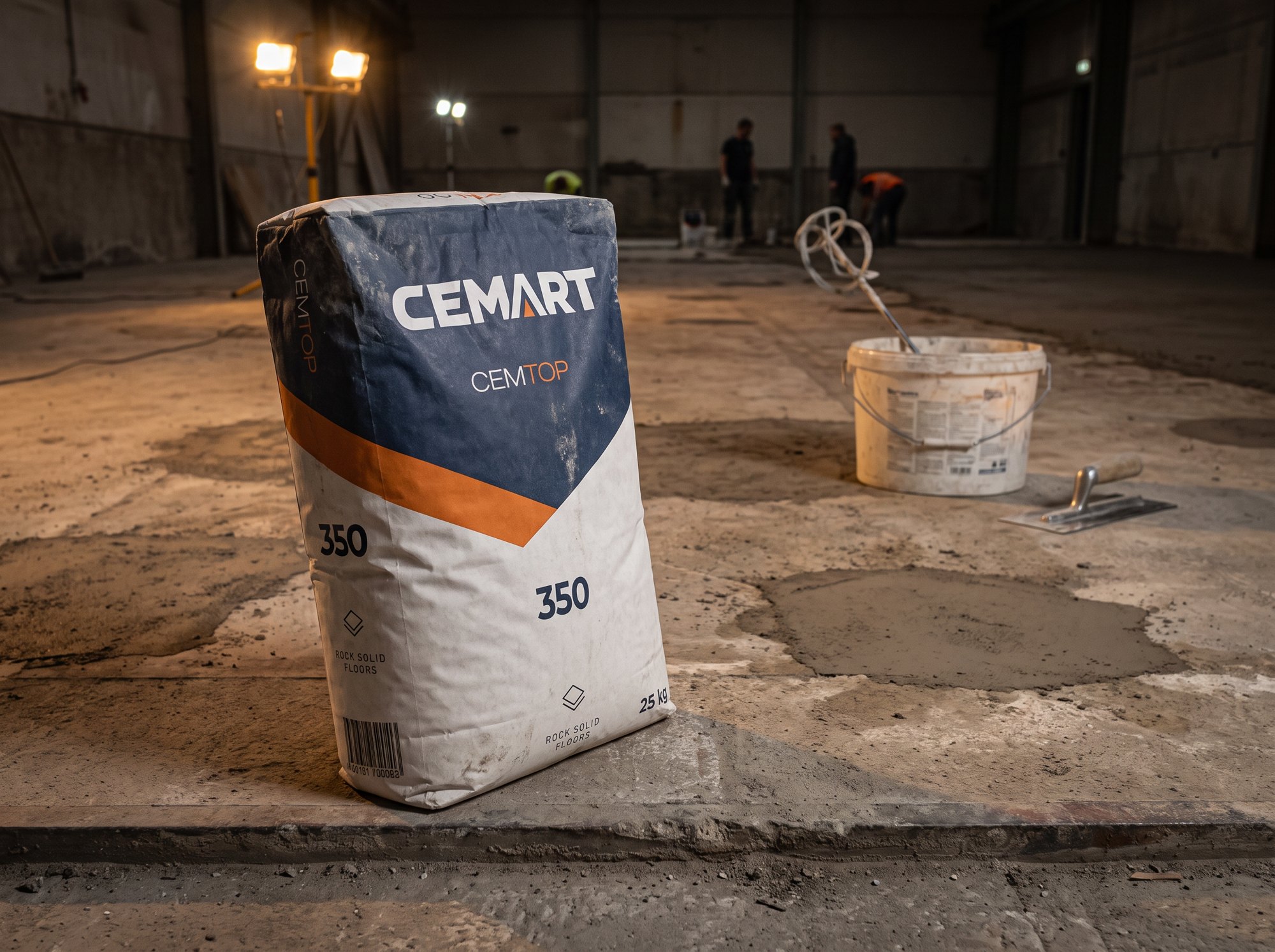
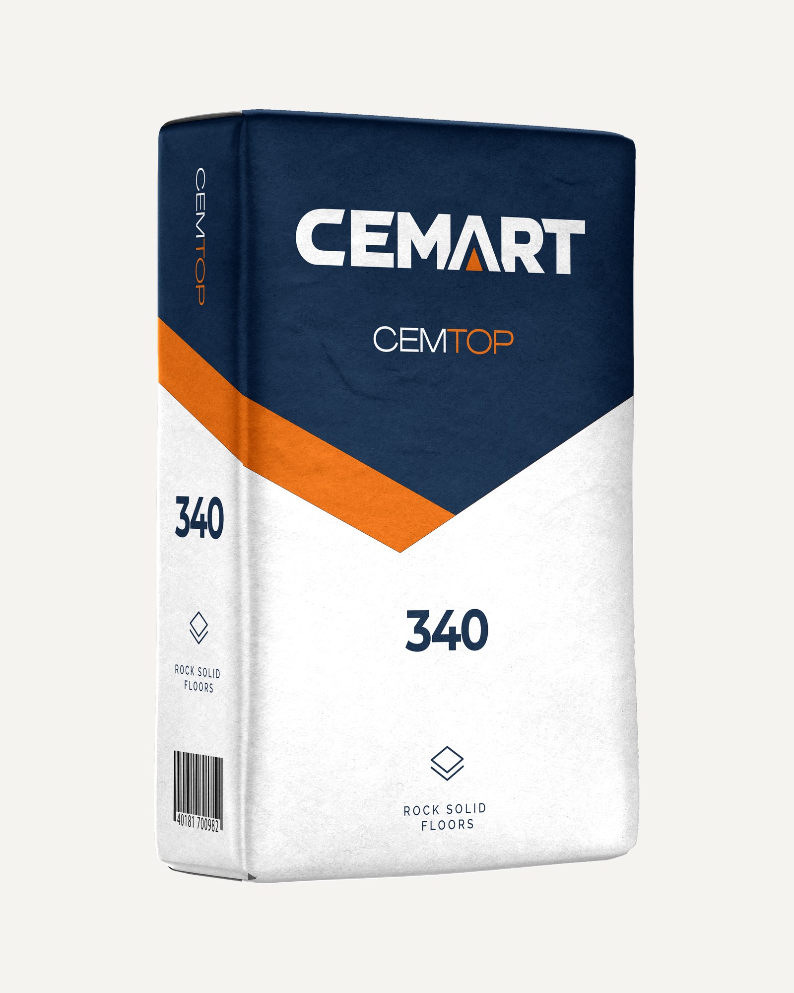
Product line for industrial floors, within the Rock Solid Floors segment.
03
Product
CEMDECO
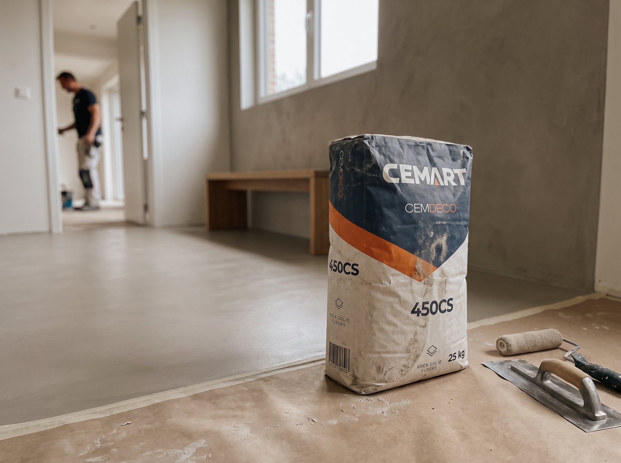
Product line for decorative floors, walls and microtoppings, within the Rock Solid Floors segment.
04
Product
CEMDURE ZERO
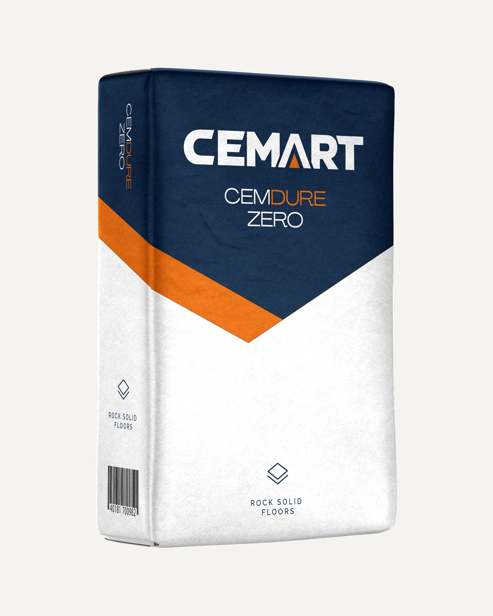
The first cement-free screed, coming in 2027. Part of the CEMDURE line within Rock Solid Floors.
Buttons are how people take the next step: request a sample, download a datasheet, register. Square like the rest of the brand, easy to tap on site. Each band shows them on one of Cemart's colours; hover or press to try.
Primary
The one main action per view. Orange with chalk text; navy with chalk text on orange. Chalk on orange is 3.0:1, an accepted exception. Optional icon on the left.
Secondary
Outline, 2px. On hover the fill drops in as the brand's slanted edge, with the orange strip leading. Same 48px height. Optional icon on the left.
Text
Link-style action. Short orange underline, the brand rule for small titles (28×3, 10:1), growing to the label width on hover. Baseline half-arrow on the right.
Pill
Filters and tags. Active is filled, inactive is outlined at 1.5px. 36px high, 12px label.
Icon button
Close, menu, bin, arrows. Bare 24px icon in a 48px tap area. No hover background: the icon pops (grows 15% with a spring); pressing squeezes it.
Cemart Navy#0B294B
Cemart Orange#E87106
Chalk#FDFCFB
Limestone#F5F3F0
Basalt#1C1D24
Two sets. Marketing icons carry the brand's message; functional icons do the everyday work. Both come in three colours, each matched to its surface.
Marketing
Waterproofing Solutions
Rock Solid Floors
WhiteOn brand colour surfaces.
WhiteOn accent colour surfaces.
Brand colourOn light surfaces.
Functional
For interfaces and labels, use the brand’s functional icons.
The photographic looks this brand uses. Each style is a written direction plus reference images: brief a photographer with it, or paste it as the pre-prompt for a generative image model.
Style 01
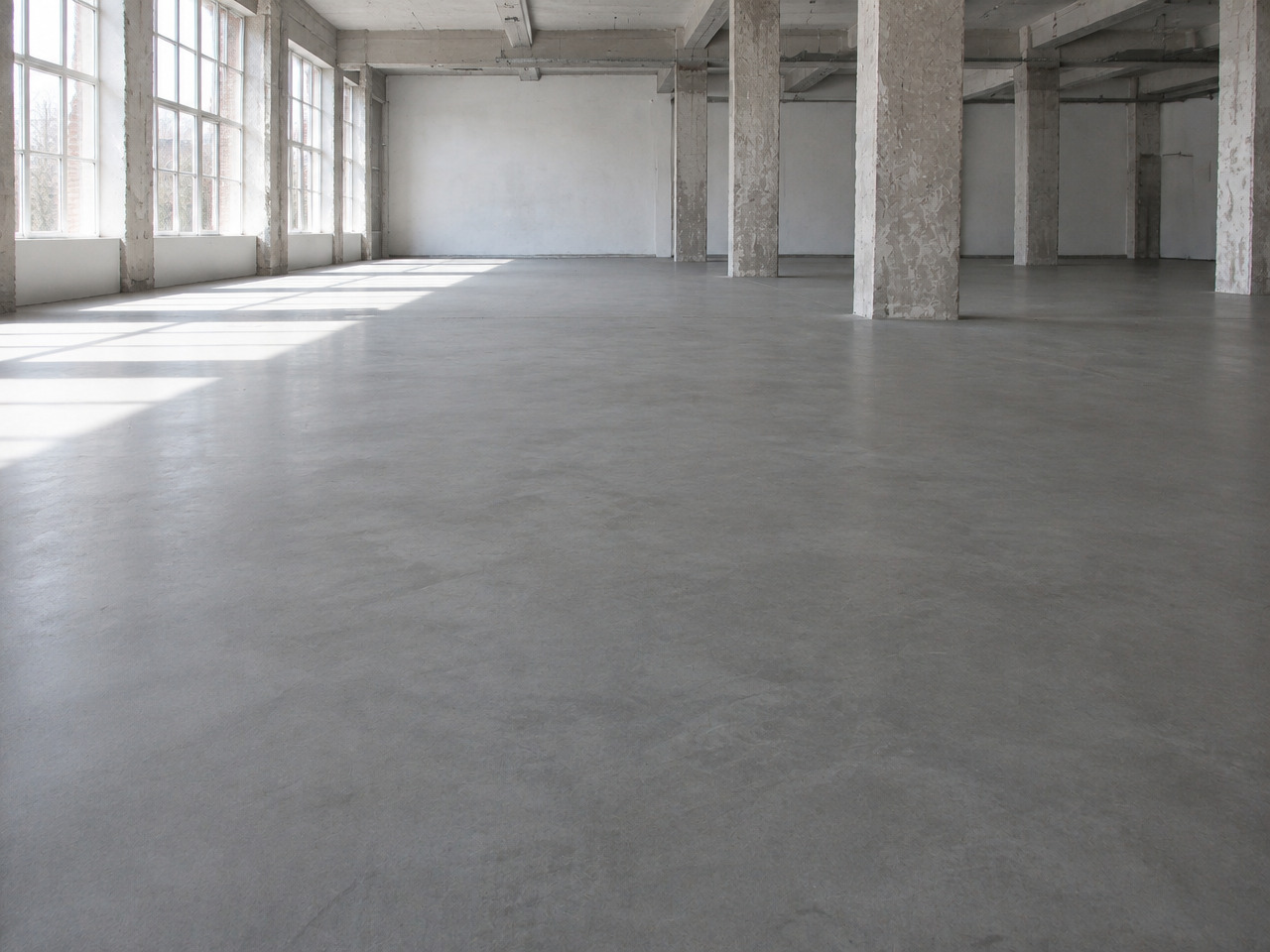
Finished product - industrial
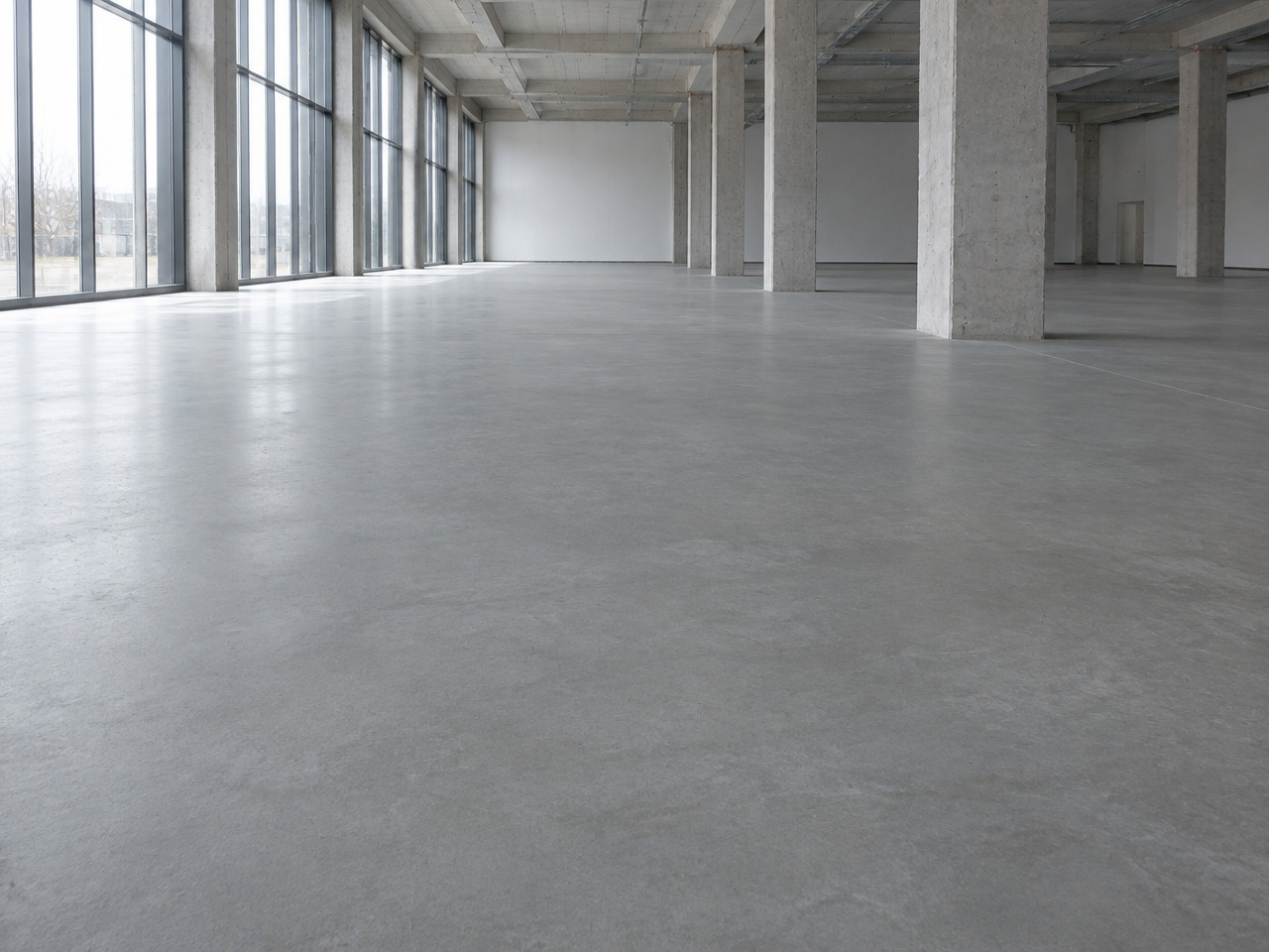
For industrial floors (Cemtop), professional and contractor pages, and any result shot for warehouses, halls, shops or offices.
The look
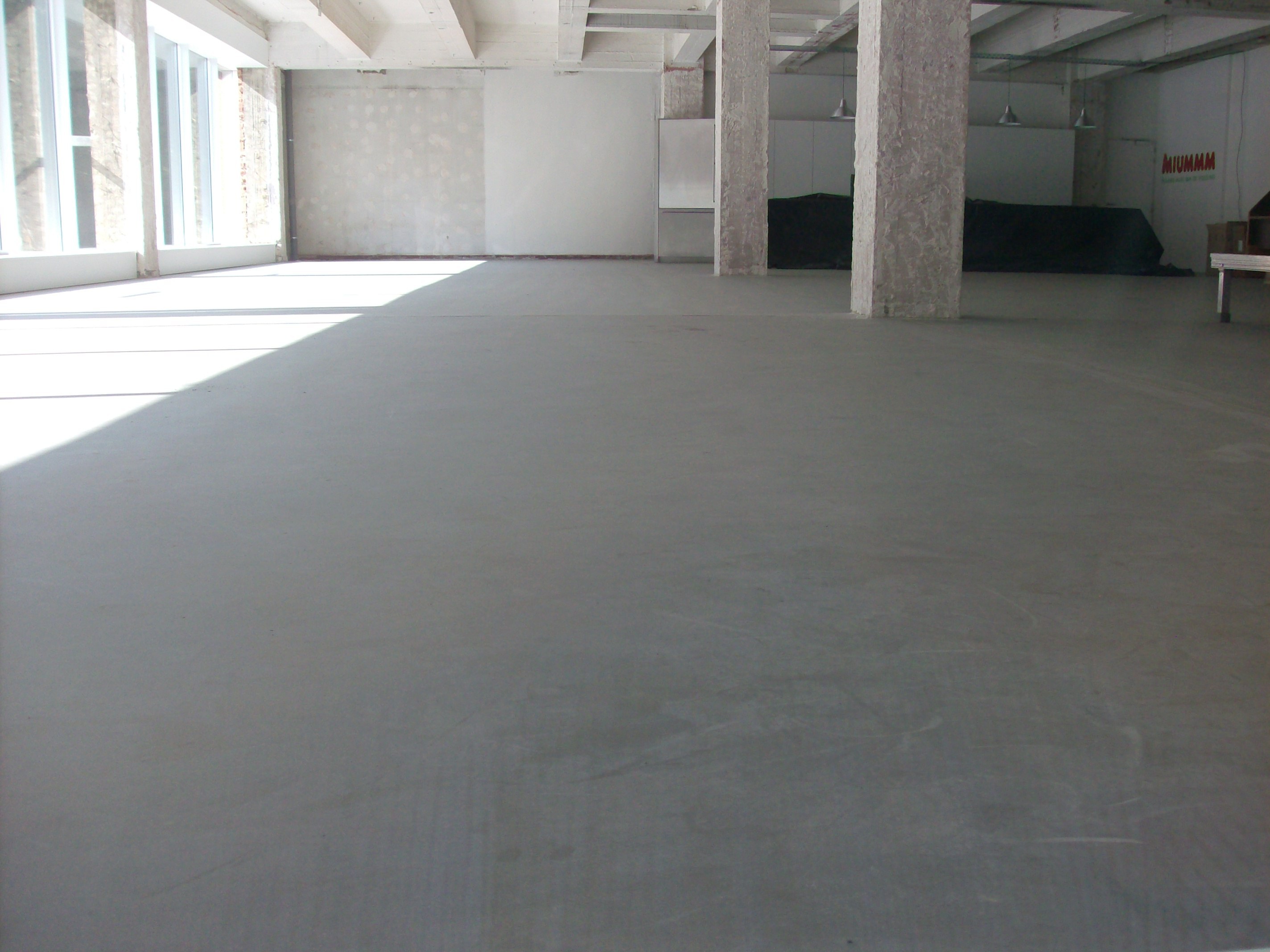
Large finished concrete and screed floors in halls, warehouses, workshops and commercial spaces, empty and ready for use. Wide eye-level or low camera close to the floor so the even surface runs to the back of the space, sharp front to back. Flat overcast or industrial daylight from big windows, soft sheen on the surface, no flash. Cool to neutral concrete greys with raw columns, white walls or steel; honest, slightly matte grade with a little grain allowed. No people, no clutter, the floor fills at least half the frame.
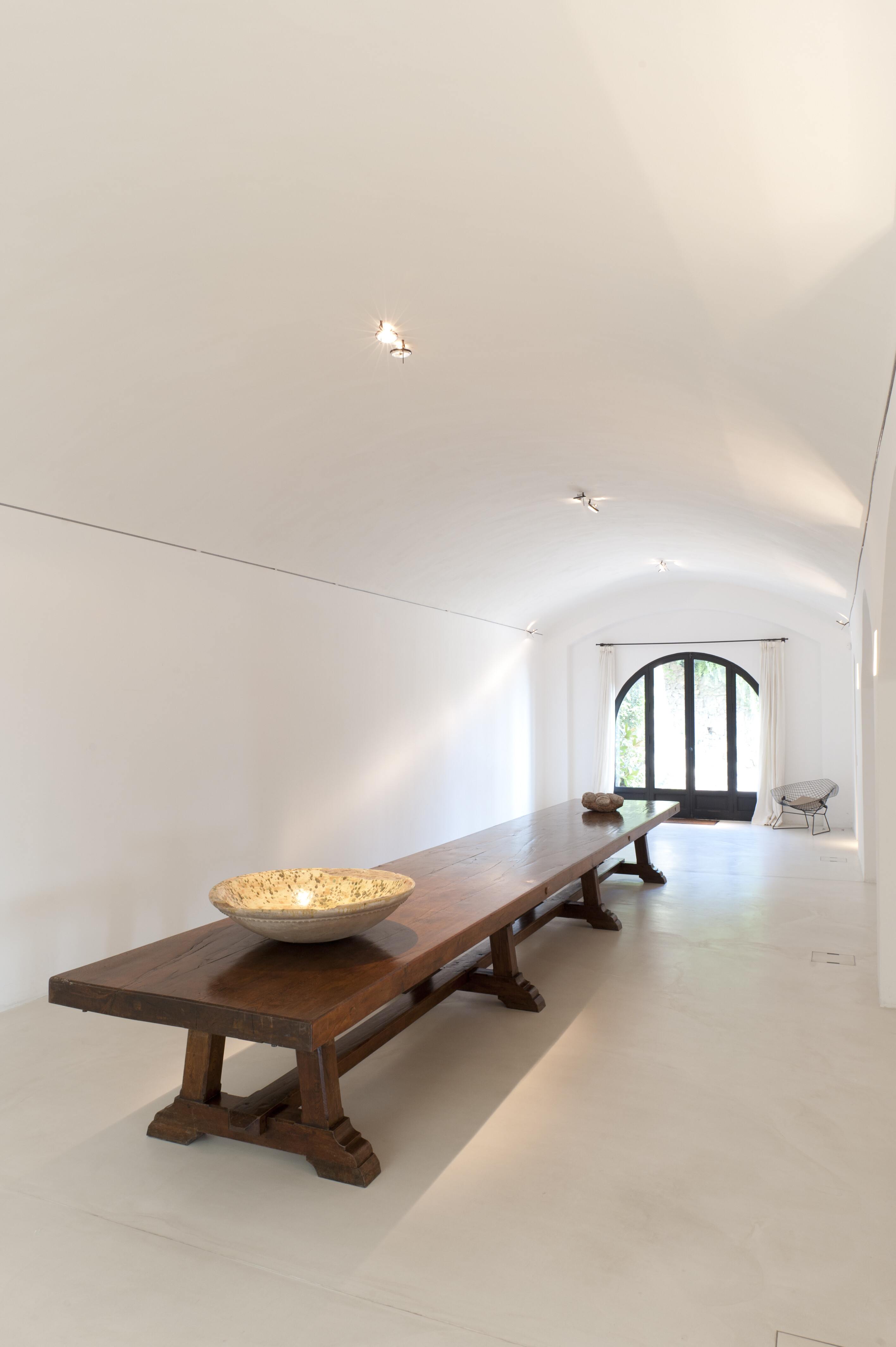
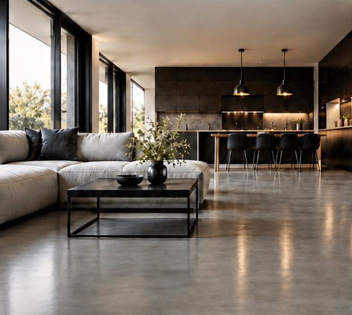
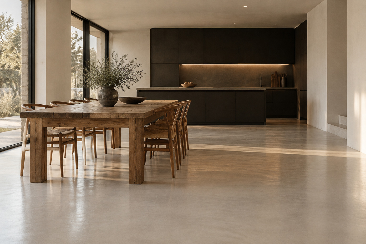
Style 02
Finished product - residential floors
For decorative floors, walls and microtoppings (Cemdeco), homepage heroes, and home or renovation stories. Also the default when a page needs a quiet, premium mood.
The look
Calm, lived-in interiors where a seamless mineral floor or microcement wall is the quiet hero. Wide or medium-wide eye-level framing with the floor taking up the lower half of the frame, slight sheen catching window light. Soft natural daylight from the side, long gentle shadows. Warm neutral palette of chalk white, limestone and warm concrete grey, with natural wood and a single dark accent; muted, slightly warm grade with clean highlights. Sparse styling, a few honest objects, generous empty space, the surface sharp to the back wall.
Style 03
Raw product
For backgrounds behind text, section breaks, invitations and campaign visuals about the material, the craft or sustainability (Cemdure Zero) rather than a finished room.
The look
The raw material on its own: cement or mineral powder in a pile, falling, drifting or being scooped. Close or macro framing, shallow depth of field, grain and particle detail sharp. Dramatic and dark: a single raking beam of light into a bare concrete room, dust hanging in the air, the pile low on a slightly reflective floor. Monochrome cool greys and deep navy-black shadows, no colour accents.
Style 04
Raw product - eco
For Cemdure Zero and anything about cement-free, ecological or sustainable products: launch material, eco claims, product pages and campaign visuals.
The look
The cement-free mineral powder as a soft, fresh pile with a few green leaves rising behind it, beaded with water drops. Close framing, eye-level or slightly above, shallow depth of field with the leaves and powder texture sharp. Bright, even, diffused studio light on a plain light warm-grey backdrop, gentle shadow under the pile. Palette of chalk white, limestone and warm grey with natural leaf green as the only colour; clean and fresh, no props, tools or badges in frame.
Style 05
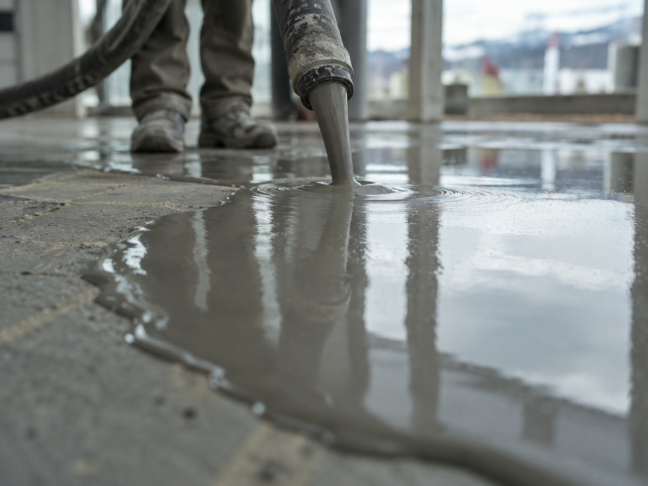
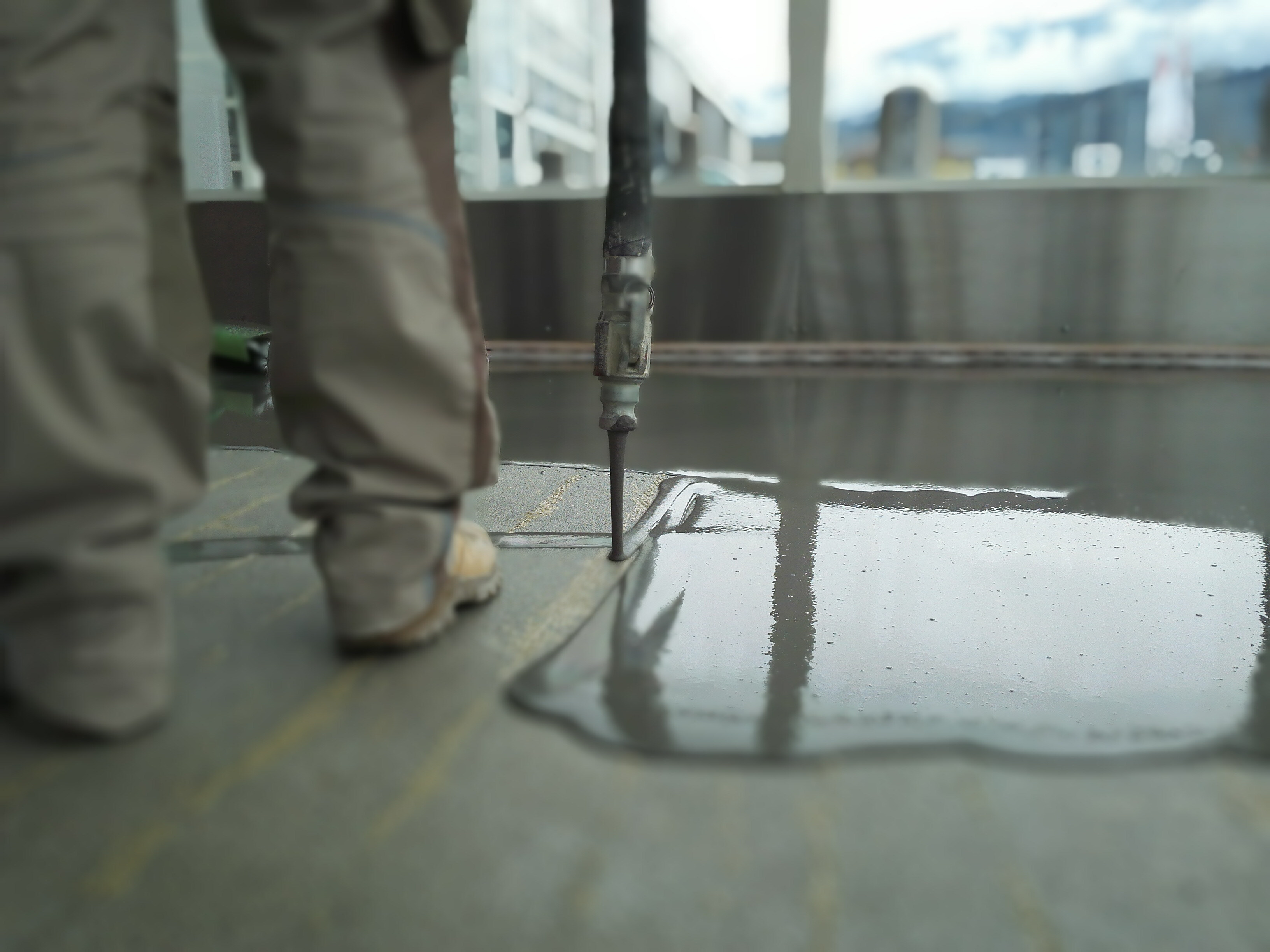
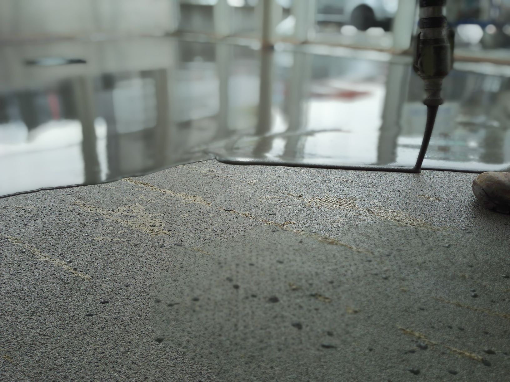
Product in construction
For levelling compounds and underlayers (Cemdure), how-it-works and application sections, technical sheets and contractor-facing content that has to show the work itself.
The look
The material being worked on site: screed or levelling compound being poured, spread or levelled. Low camera close to the floor, the wet liquid surface and its reflections in focus, the background soft. Hands, hoses, boots and tools in frame, people cropped and anonymous, real motion visible. Available site light, cool neutral greys with a slight warm cast, documentary feel with no staging or lens effects.
Style 06
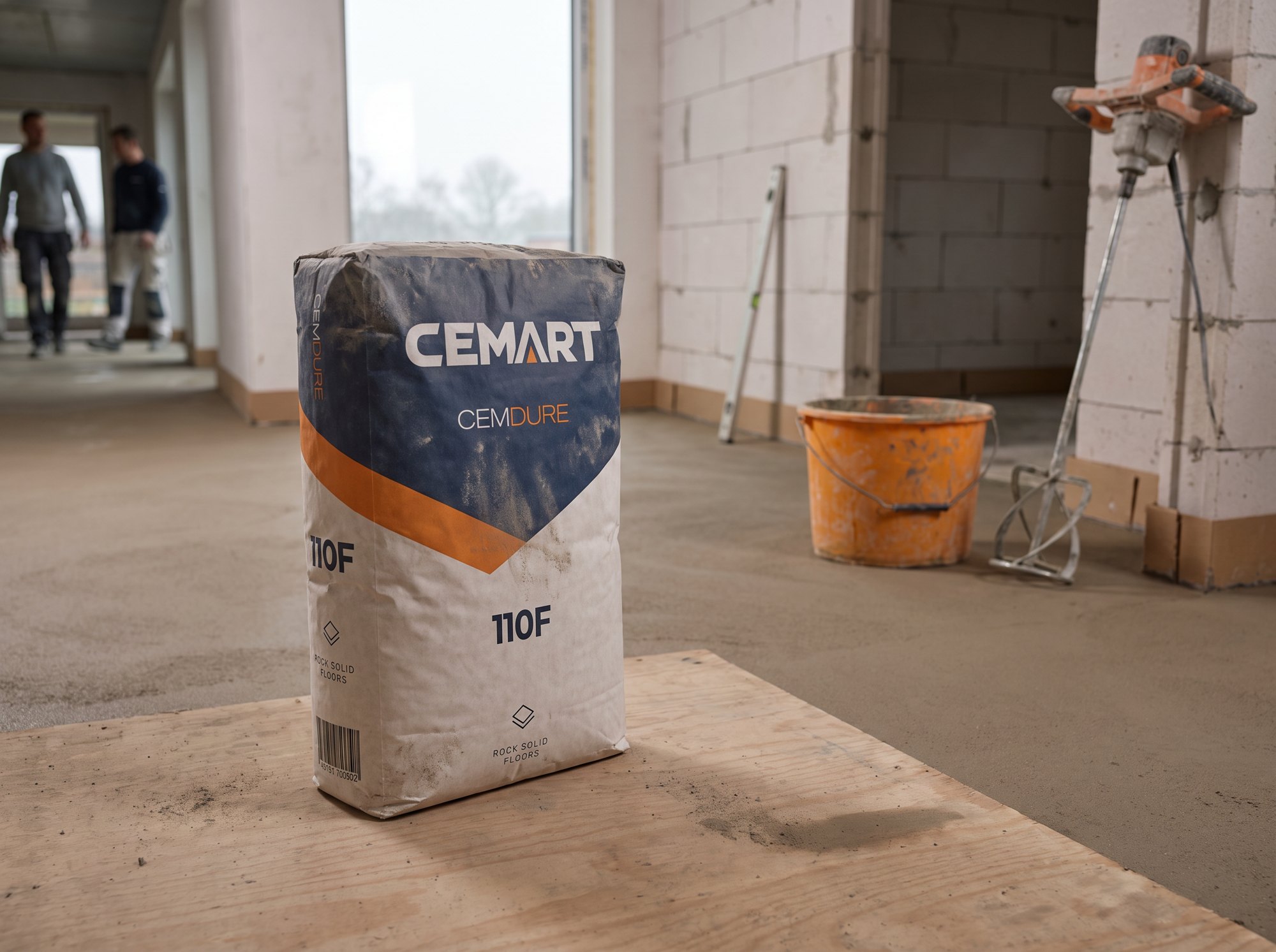
Bag on site
For product pages, social posts, trade and contractor material, and campaign visuals that show the product in use on a real site.
The look
A real Cemart product bag on a working building site, documentary and unstaged. The bag is fixed; the site must never look the same twice. Bag rules: use the supplied bag artwork exactly, never redraw or retype it and never add text, logos, numbers or a kg weight that are not on the artwork; upright or naturally slumped, true 25 kg scale; grounded with a real contact shadow and some site dust; label facing the camera at a slight angle and legible; bag sharp, in the foreground or about a third of the frame. Cemart sells bagged, factory-mixed mortars, not concrete: never show concrete being poured, a concrete truck or pump, wet slurry spreading across the floor, power floating, rebar or formwork. Every surface in frame is dry or set. Site, for whoever writes the image prompt: do not pass these lists to the image model. First read the product name on the bag and use only that product's list; the site must match the job the product does. Then pick ONE option from each of its lists at random (roll a number per list, every option equally likely), write the result as one line such as "CEMDECO, bathroom renovation, primed walls with masking tape, soft window light, eye-level 35mm", and describe only that setup in the prompt. For a series, every image gets a new roll and no two images share site, light or framing. CEMDURE and CEMDURE ZERO (subfloors and screeds, the rough build inside a closed building): site: cellar or basement, 1930s townhouse renovation with stripped floors, apartment in a new block, new-build terraced house, old farmhouse renovation with timber beams, school or office floor; stage: insulation boards laid, underfloor heating pipes laid on the slab, cured screed with edge strips along the walls, bare clean slab ready for screed. CEMTOP (industrial floors): site: industrial hall with steel frame, warehouse, garage or car workshop, loading bay, production floor; stage: cleaned and prepared slab, a finished hard-wearing floor with line markings, a repaired section of an old industrial floor. CEMDECO (decorative floors, walls and microtoppings, the finishing stage of a nearly finished interior): site: living room, kitchen, bathroom or shower, staircase, shop or restaurant fit-out, office reception; the look is the result: a modern interior with a seamless, softly mottled microcement floor or wall in warm grey, clean lines, little furniture, the job just finished; stage: the finished microcement floor freshly sealed, a microcement wall and floor in one continuous surface, the last corner being finished by a trowel while the rest of the room is done. Never a raw shell, blockwork or an open roof for CEMDECO. Light, for every product: warm work lamps in a dark space, soft overcast window light, cold blue dusk, golden hour through openings, low winter sun. Surface under the bag: plywood sheet, insulation board, protective floor cover, a step or threshold, a wooden pallet (CEMDURE and CEMTOP only). Framing: tight 85mm with creamy blurred background, overhead 3/4 view, eye-level 35mm, very low wide-angle at floor level. Props few and incidental and matched to the job: bucket and paddle mixer, steel trowel, spirit level, masking tape and roller for CEMDECO. People optional; if present they are small, far away and out of focus, never posed or facing the camera. Belgian and Northern European building practice. Honest, practical, warm greys, slightly matte grade, no glossy ad look, no other brands' logos or text.
Style 07
Product mockup
For the main product image on product pages, shop listings, datasheets, catalogues and anywhere a product is shown on its own. For a bag in a real setting, use Bag on site.
The look
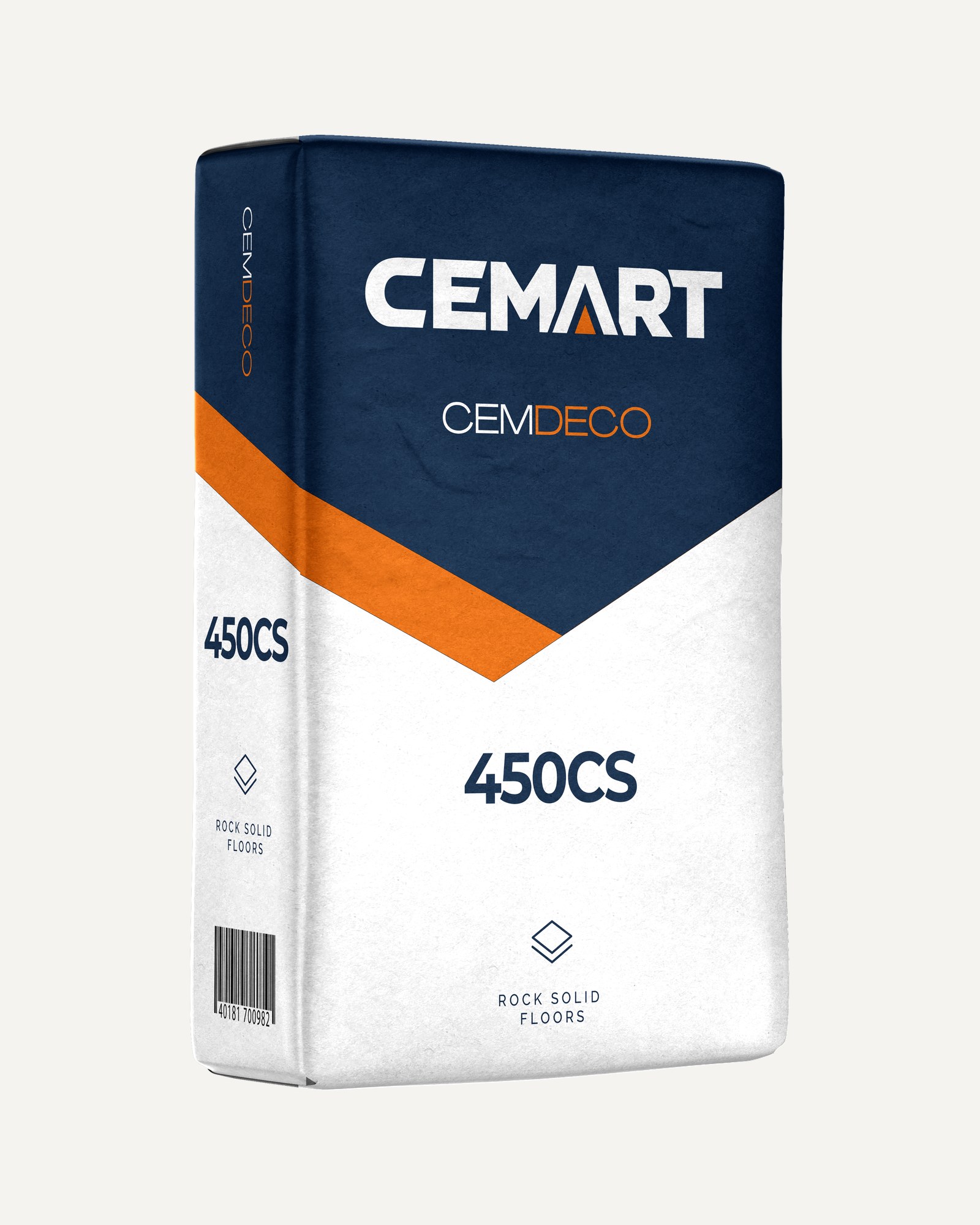
The main packaging shot is never photographed and never generated. It is always rendered from the real bag artwork, so every product looks the same on every channel: the same bag shape, the same three-quarter angle from the left, the same soft studio light, upright, on a plain light background or cut out. Only the artwork changes per product, and it is placed exactly as supplied: never redrawn, retyped or recoloured, and nothing added that is not on the artwork.
Avoid
a photographer's packshot, an AI-generated bag, a different angle or bag shape, props, hands, scenery, dust or shadows that do not come from the render.
Cemart sounds like a seasoned maker talking to a fellow professional on site: calm, sure of its products, short and to the point. We say what a product does, where it goes and why it holds. We never shout and never oversell.
Facts first
Lead with what the product does, the layer thickness, where it is used. Benefits follow from facts.
Short and solid
Short sentences, one idea each. Headlines in capitals, at most six words.
Expert, not academic
We know the chemistry, but we write for the screed layer, the contractor and the architect. Technical words where the trade uses them (egaline, chape, primer), plain words everywhere else.
Proud, never loud
We are proud to be a Belgian maker, European seller and specialist in chemistry. We show it with proof, not with superlatives.
Address
NLalways "je"
"u" sounds old-fashioned; on site, people say "je".