








Brand Guide
v1.0 / 2026-06-01
Oh Lord
Download brand package

Guidelines on how to implement the Day & Night Service visual brand system for cross media applications.

Tagline

Quality service with a smile.

Tone
Casual yet professional. Confident and bold. Charming and stylish. Never corporate, never stiff. Uses conversational language mixed with sophisticated service-industry vocabulary.
Audience
Event planners, hospitality venue managers, luxury brands (B2B primary). Job-seekers in hospitality (secondary). Multilingual: English, Dutch, French.
Pillars

Premium positioning (high-end events, brand activation). Team excellence (seasoned, charming, composed staff). Experience delivery (turning service into memorable moments). Reliability with style (the execution partner behind the scenes).

In one breath
# Voice Day & Night Service is not your average staffing agency. It's the secret weapon behind unforgettable hospitality. The voice is confident, charming, and direct. Copy should feel like a stylish colleague talking, not a brochure reading.

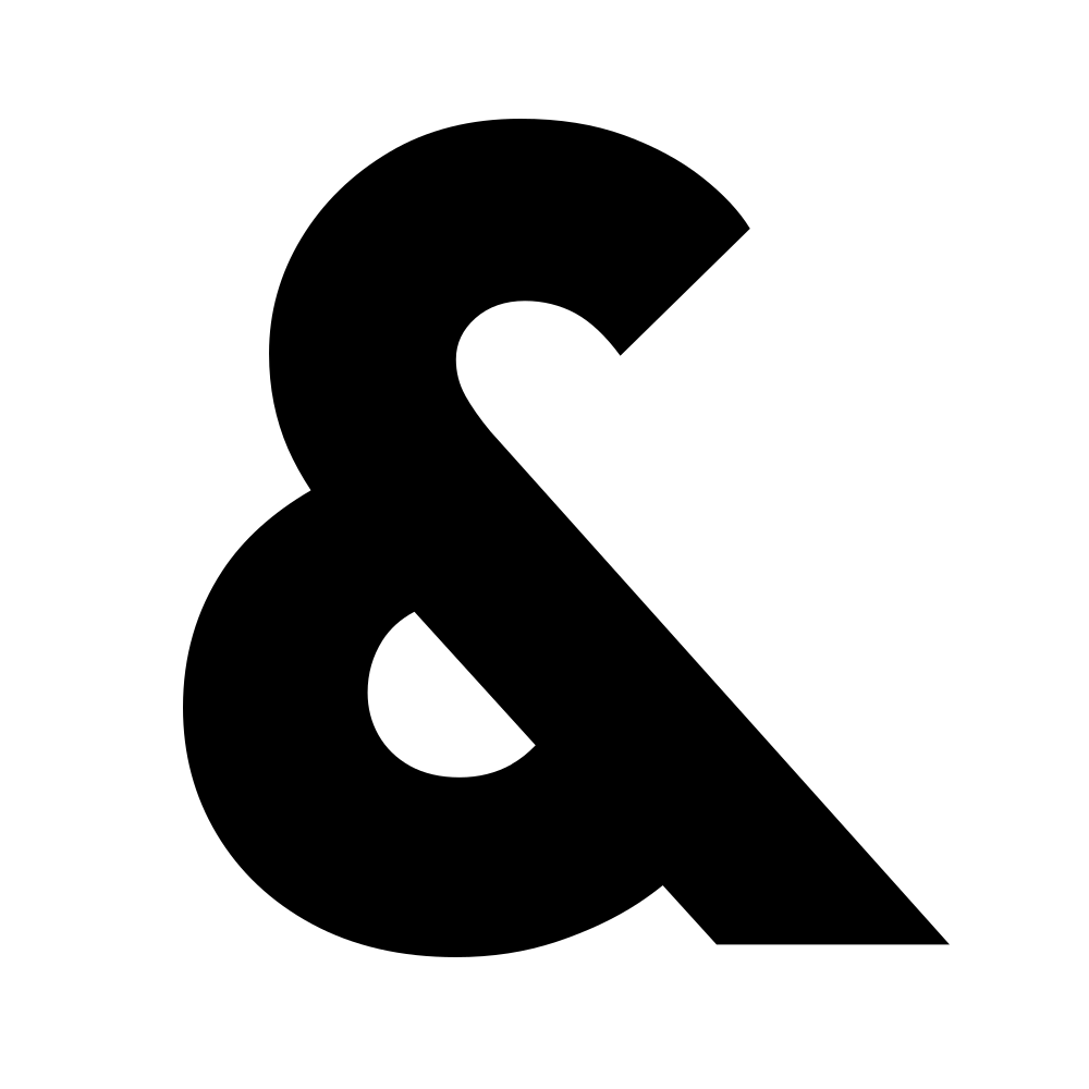
The ampersand (&) is the sole decorative shape. It IS the brand mark. Rendered with the pink-to-purple gradient (linear-gradient 180deg, #C53B70 → #481C5F). Used as favicon, custom cursor state, and sparse decorative element.

Assetshape-shape-1-asset.svg
Rotationfixed
Color usagebrand-only
Utilisationsparse
Size range530 (relative)
NotesThe ampersand (&) is the brand mark. Used as favicon, cursor state, and decorative element. Always rendered with the pink-to-purple gradient fill. Never rotated.

The core palette. Every swatch is copy-on-click — click the chip to grab the hex.

PrimaryHex#1C1B1CRGB28, 27, 28CMYK0 / 4 / 0 / 89
BlacksHex#1C1B1CRGB28, 27, 28CMYK0 / 4 / 0 / 89
SecondaryHex#FFFFFFRGB255, 255, 255CMYK0 / 0 / 0 / 0
WhitesHex#FFFFFFRGB255, 255, 255CMYK0 / 0 / 0 / 0
AccentHex#C53B70RGB197, 59, 112CMYK0 / 70 / 43 / 23
HighlightHex#8765AFRGB135, 101, 175CMYK23 / 42 / 0 / 31
Visual balance

Each part of the circle represents how much of this colour should roughly be used in the system. Creativity is encouraged for special use-cases (promo, posters, etc.) but clean branded work should respect it.

  • Primary43%
  • Blacks29%
  • Secondary17%
  • Whites10%
  • Accent2%
  • Highlight0%
Primary gradientlinear-gradient(180deg, #C53B70 0%, #8765AF 45%, #E2E0DB 100%)
Accent gradientlinear-gradient(180deg, #C53B70 0%, #481C5F 100%)
Subtle gradientlinear-gradient(180deg, #1C1B1C 0%, #2a1a2a 50%, #1C1B1C 100%)
Gradient intent

Used as a central fade at any size, to fill dark voids creatively without occupying a true page element.

# Typography Outfit for all display, navigation, and button text — always uppercase for titles. Inter for body copy and form labels at 600 weight. Quattrocento as serif fallback. Antialiased rendering. Responsive scale from 13px (cards) through 4rem (hero titles).

Hero / Display
Outfit
Body
Inter
Alt / Serif
Quattrocento
Scale

Every step in the system.

H1
64/64 · 700 · All caps
hero · tracking -0.41
Display heading set in the hero face.
Abcdefghijklmnopqrstuvwxyz 0123456789 .,;:!?&
H2
45/49 · 700 · All caps
hero · tracking -0.202
Section title built from the same hierarchy.
Abcdefghijklmnopqrstuvwxyz 0123456789 .,;:!?&
H3
40/48 · 600 · Normal case
body · tracking 0
Body face at the largest editorial step. Use it for opening passages and emphatic statements.
Abcdefghijklmnopqrstuvwxyz 0123456789 .,;:!?&
H4
25/30 · 600 · Normal case
body · tracking 0
Body face at the mid-editorial step. Used for sub-headings and lede paragraphs.
Abcdefghijklmnopqrstuvwxyz 0123456789 .,;:!?&
H5
22/44 · 400 · All caps
hero · tracking 0
Caption-style heading
Abcdefghijklmnopqrstuvwxyz 0123456789 .,;:!?&
H6
13/18 · 400 · All caps
hero · tracking 0
Smallest heading
Abcdefghijklmnopqrstuvwxyz 0123456789 .,;:!?&
Body Base
17/19 · 600 · Normal case
body · tracking 0
Body face at the running text scale. Comfortable for paragraphs of up to 70 characters per line.
Abcdefghijklmnopqrstuvwxyz 0123456789 .,;:!?&
Body Small
14/21 · 400 · Normal case
body · tracking 0
Body face at the small annotation scale. Captions, footnotes, table cells.
Abcdefghijklmnopqrstuvwxyz 0123456789 .,;:!?&
Caption
13/18 · 400 · All caps
hero · tracking 0
Brand guide / Version 1.0
Abcdefghijklmnopqrstuvwxyz 0123456789 .,;:!?&
Button
22/22 · 400 · All caps
hero · tracking 0
Take action
Abcdefghijklmnopqrstuvwxyz 0123456789 .,;:!?&
Label
17/19 · 600 · All caps
body · tracking 0.202
Section label
Abcdefghijklmnopqrstuvwxyz 0123456789 .,;:!?&

# Spacing Section gaps use viewport units on the actual site (8vh–20vh spacers, 12vh being the most common), which translates to roughly 50–80px at typical viewports. Container max-width 1920px with 60px side padding (40px mobile). Form grid gaps are 10px between fields, 49px between form sections. Page top padding is 12rem (192px) across all breakpoints.

Base unit8 pxEvery spacing decision lands on a multiple of 8.
Section gap / Mobile50 px
Section gap / Desktop80 px
Container padding / Mobile40 px
Container padding / Desktop60 px
Card padding / Mobile16 px
Card padding / Desktop16 px
Element gap / Mobile10 px
Element gap / Desktop10 px

There is no elevation system. Depth comes from negative space, hairline borders, glass overlays, and a single accent glow reserved for moments of brand declaration.

No drop shadows. Depth through restraint.

shadow.style: none, confirmed by the brand file.

Hairline border1px var(--border-default).
Glass overlayTranslucent + backdrop-blur(12px).
Accent glowrgba(197, 59, 112, 0.25) 0 0 40px

# Buttons All buttons use 0px border-radius (sharp corners). Primary is filled brand-black with white text. Secondary is hollow: no fill, 2px white ring inset, hover adds 10% white overlay. Pills are the contact form toggle chips: inactive = hollow (same as secondary), active = white fill with black text. Typography (font, size, weight, uppercase) comes from token.button.* in typography.md. Icon buttons disabled.

Base / #1C1B1C
Hover to see overlay behaviour.
Inverted / #FFFFFF
Hover to see overlay behaviour.
Primary / #1C1B1C
Hover to see overlay behaviour.
Secondary / #FFFFFF
Hover to see overlay behaviour.
Accent / #C53B70
Hover to see overlay behaviour.
Highlight / #8765AF
Hover to see overlay behaviour.

Toggle chips for filters and contact-form selections. Active state flips fill and text. There is no halfway hover.

Base / #1C1B1C
Inactive = hollow ring. Active = fill flipped.
Inverted / #FFFFFF
Inactive = hollow ring. Active = fill flipped.
Primary / #1C1B1C
Inactive = hollow ring. Active = fill flipped.
Secondary / #FFFFFF
Inactive = hollow ring. Active = fill flipped.
Accent / #C53B70
Inactive = hollow ring. Active = fill flipped.
Highlight / #8765AF
Inactive = hollow ring. Active = fill flipped.

No icon library. Custom outline SVGs at 1.5px stroke, rendered at three sizes. Icons inherit text color by default.

Small · 16px
Medium · 24px
Large · 40px

# Motion Page entry uses ease-out cubic-bezier (0.35s), exit uses ease-in (0.25s). Button hovers at 0.3s ease. Cookie banner at 0.35s with custom cubic-bezier. GSAP scroll-scrub is linear (scrub: 1.2). Cursor tracking at 0.05s linear. Glacial tier reserved for the glitch loop (3s infinite).

EasingCurveCubic-bezierDemo
Defaultdefault
Enterenter
Exitexit
Expressiveexpressive
Duration ladder
Instant50 ms
Fast200 ms
Normal350 ms
Slow500 ms
Glacial3000 ms

Motion is layered: CSS keyframes for entry and glitch, GSAP for scroll-driven hero, CSS transitions for interactive states. The glitch effect on headings is the most recognizable brand motion signature. Page transitions use the View Transitions API with staggered children.

text-reveal · entryentry
One Two Three Four

Words rise into place with a brief translate + opacity entry; siblings stagger by 70ms so the line builds left-to-right rather than landing all at once.

underline-scaleX · hoverhover
Hover state

Menu underlines scale in from the right on hover, then unwind from the left on release. The asymmetric transform-origin is what makes it read as a deliberate gesture rather than a default browser hover.

gsap-scroll-scrub · scrollscroll
Scroll-scrubbed

Hero copy and imagery decouple from scroll via GSAP with `scrub: 1.2`. The lag keeps the animation feeling weighted to the scrubbed input rather than tied 1:1 to wheel deltas.

ring-pulse · statusstatus

A 14-px dot with a pulsing concentric ring. Used for live indicators, "online" badges, and any place a static green dot would feel inert.

glitch-text · signaturesignature
DAY & NIGHT

The signature motion. Two pseudo-elements offset in opposite directions over a 3-second loop, with mixed accent + highlight tones screening against the base. Reserved for a single emphasis word per page.

The disciplines this brand keeps. Distilled into the layout role doc by the Appostle scraper. What every page, modal, and surface is held against.

01

Gradient or light for surfaces

Surfaces are either the pink-to-purple brand gradient or a light field. Gradient sections are where the brand registers — landings, hero blocks, signature moments. Light sections carry long-form content and anything that needs to be readable at a glance. Brand-black #1C1B1C is reserved for type, inverted pills, and tightly scoped UI moments. Never the default canvas.
02

Hairlines over shadows

There is no elevation system. Depth lives in 1px borders, color contrast, and the deliberate use of negative space. A single accent glow (pink, 25% opacity, 40px blur) is the only exception, reserved for emphasis.

03

Asymmetric over symmetrical

Centered heroes are banned. Use left-aligned text with offset counterweights, split columns, or large vertical voids. The grid is invisible but always present underneath.

04

Generous whitespace

Section gaps land between 50px and 80px at viewport breakpoints, and page top-padding is 12rem across all breakpoints. Sections breathe. Content earns its room.

05

One accent, used sparingly

Pink #C53B70 is the accent. It appears on CTAs, links, focus rings, and the ampersand mark. Almost nowhere else. Purple #8765AF is a support tone, used inside the gradient rather than as a flat fill.

06

Gradient = brand signature

The pink → purple gradient (180deg, #C53B70 → #8765AF → #E2E0DB) is the brand's signature surface. It carries the background on hero sections and brand-forward moments. The shorter accent gradient (#C53B70 → #481C5F) is reserved for the ampersand mark.

07

The ampersand carries the brand

When in doubt, the & mark with the brand gradient is the brand. It works as favicon, cursor state, decorative element. Never rotated.

Need help implementing this brand?

Oh Lord

We create almighty brands.