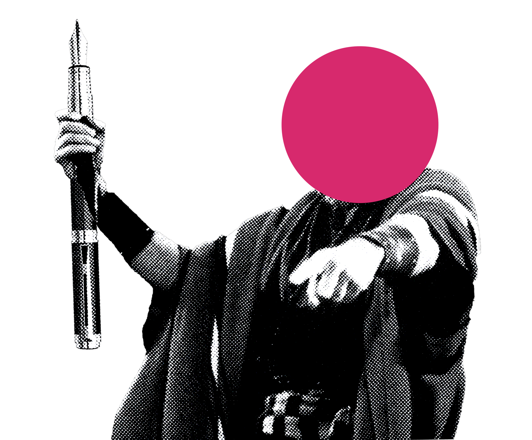
The identity system for Oh Lord, a branding studio that builds brands which refuse to blend in.
The logo comes as a horizontal lockup, a stacked vertical, and a standalone mark, each in full color and monochrome, for light and dark surfaces. Pick the variant the surface asks for; never rebuild a lockup by hand.










The mono variants are for monotone output: black-and-white print, a single-colour t-shirt stencil, engraving or embossing, or anywhere the full-colour logo cannot be reproduced.
Give it room
Keep clear space around the logo equal to the height of the mark. Place it on a solid surface, not over busy imagery. When color would fight the background, use the monochrome version rather than adding an outline, a shadow, or a container.
Bone paper and black do the work; the pink is the signature. It is used at small scale and with intent, on calls to action and the one thing on screen that matters most. Spread it everywhere and it stops meaning anything.
Each part of the circle represents how much of this colour should roughly be used in the system. Creativity is encouraged for special use-cases (promo, posters, etc.) but clean branded work should respect it.
- Bone Paper33%
- Pure White26%
- Absolute Black22%
- Signal Pink14%
- Graphite5%
Used as a central fade at any size, to fill dark voids creatively without occupying a true page element.
One typeface carries the whole system: Inter Tight, from the 220px headline down to the 14px label. The hierarchy is built from size, weight and tracking, not from a second family.
Every step in the system.
Need help implementing this brand?