The working brand system behind The Street Food Company, reconciled against the live site, not reconstructed from memory.
The crest is the full mark and it needs room. Where there is no room, the short form does the same job in a fraction of the space.
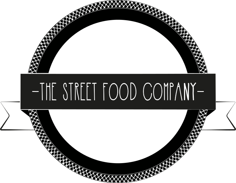
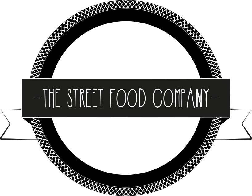



The mono variants are for monotone output: black-and-white print, a single-colour t-shirt stencil, engraving or embossing, or anywhere the full-colour logo cannot be reproduced.
Half the cap-height of the mark on every side.
The logo always appears on solid backgrounds. Never over imagery. Mark and wordmark stay on the same baseline whenever they are paired. Mono variants are used when the surface forbids the color treatment.
Four colours, no spares. Yellow carries the brand, near-black holds the page, cream and white do the reading. Every swatch is copy-on-click.
Each part of the circle represents how much of this colour should roughly be used in the system. Creativity is encouraged for special use-cases (promo, posters, etc.) but clean branded work should respect it.
- Secondary43%
- Primary31%
- Blacks21%
- Accent6%
Three typefaces, three jobs. Barlow does the shouting: regular width, black, all-caps on every headline and button. Prompt does the talking, Light 300 and cased, for body copy and labels. Patua One is the slab that sets section headings. Headlines stay uppercase; body copy stays cased and light.
Every step in the system.
Need help implementing this brand?