


Brand Guide
v1.8 / 2026-10-21
Oh Lord
Download brand package

Guidelines on how to implement the Zuse Group visual brand system for cross media applications.

BronzeRGBCMYK
Canvas BlackRGBCMYK
Mist WhiteRGBCMYK
GraphiteRGBCMYK
Slate GreyRGBCMYK
Bronze ShadowRGBCMYK
Warm HairlineRGBCMYK
Bronze HighlightRGBCMYK
Warm PanelRGBCMYK

Visual balance.

Each part of the circle represents how much of this colour should roughly be used in the system. Creativity is encouraged for special use-cases (promo, posters, etc.) but clean branded work should respect it.

  • Bronze17%
  • Canvas Black49%
  • Mist White13%
  • Graphite11%
  • Slate Grey4%
  • Bronze Shadow2%
  • Warm Hairline2%
  • Bronze Highlight1%
  • Warm Panel1%
Ember Glow gradientradial-gradient(40% 35% at 45% 18%, rgba(232,103,79,0.16) 0%, rgba(232,103,79,0) 100%), radial-gradient(75% 55% at 45% 12%, rgba(166,75,53,0.26) 0%, rgba(166,75,53,0) 100%), radial-gradient(70% 85% at 100% 60%, rgba(114,44,35,0.17) 0%, rgba(114,44,35,0) 90%), radial-gradient(65% 65% at 5% 95%, rgba(114,44,35,0.12) 0%, rgba(114,44,35,0) 90%), #09090b
Gradient intent

Used as a central fade at any size, to fill dark voids creatively without occupying a true page element.

Hero / Display
Saans

Hero typeface — display/headline.

Regular400
Medium500
SemiBold600
Body
Saans

Body typeface.

Regular400
Medium500
SemiBold600
Accent
Geist Mono

Alt typeface — monospace or alternative.

Light300
Regular400
Medium500
SemiBold600
Bold700
ExtraBold800
Scale

Every step in the system.

Desktop sizes

Headings

  • H1Display heading set in the hero face.96px
    Font
    Saans Regular 400
    Desktop
    96 / 86 px
    Tracking
    -5.0%
    Case
    Normal case
  • H2Section title built from the same hierarchy.60px
    Font
    Saans Regular 400
    Desktop
    60 / 65 px
    Tracking
    -4.5%
    Case
    Normal case
  • H3Body face at the largest editorial step. Use it for opening passages and emphatic statements.48px
    Font
    Saans Regular 400
    Desktop
    48 / 52 px
    Tracking
    -4.0%
    Case
    Normal case
  • H4Body face at the mid-editorial step. Used for sub-headings and lede paragraphs.36px
    Font
    Saans Regular 400
    Desktop
    36 / 43 px
    Tracking
    -3.5%
    Case
    Normal case
  • H5Caption-style heading22px
    Font
    Saans Medium 500
    Desktop
    22 / 29 px
    Tracking
    -2.5%
    Case
    Normal case
  • H6Smallest heading18px
    Font
    Saans Regular 400
    Desktop
    18 / 23 px
    Tracking
    -2.0%
    Case
    Normal case

Body

  • Body BaseBody face at the running text scale. Comfortable for paragraphs of up to 70 characters per line.16px
    Font
    Saans Regular 400
    Desktop
    16 / 27 px
    Tracking
    0.0%
    Case
    Normal case
  • Body SmallBody face at the small annotation scale. Captions, footnotes, table cells.15px
    Font
    Saans Regular 400
    Desktop
    15 / 23 px
    Tracking
    0.0%
    Case
    Normal case

Labels / Accent

  • CaptionBrand guide / Version 1.012px
    Font
    Geist Mono Regular 400
    Desktop
    12 / 17 px
    Tracking
    12.0%
    Case
    All caps
  • ButtonTake action14px
    Font
    Saans Regular 400
    Desktop
    14 / 17 px
    Tracking
    4.0%
    Case
    All caps
    Usage
    Typography pointers for button text.
  • LabelSection label12px
    Font
    Saans Regular 400
    Desktop
    12 / 16 px
    Tracking
    4.0%
    Case
    All caps
StyleDesktopTrackingCase
H1Saans Regular 400
Display heading set in the hero face.
Desktop · px / line height96/86Tracking-5.0%CaseNormal case
H2Saans Regular 400
Section title built from the same hierarchy.
Desktop · px / line height60/65Tracking-4.5%CaseNormal case
H3Saans Regular 400
Body face at the largest editorial step. Use it for opening passages and emphatic statements.
Desktop · px / line height48/52Tracking-4.0%CaseNormal case
H4Saans Regular 400
Body face at the mid-editorial step. Used for sub-headings and lede paragraphs.
Desktop · px / line height36/43Tracking-3.5%CaseNormal case
H5Saans Medium 500
Caption-style heading
Desktop · px / line height22/29Tracking-2.5%CaseNormal case
H6Saans Regular 400
Smallest heading
Desktop · px / line height18/23Tracking-2.0%CaseNormal case
Body BaseSaans Regular 400
Body face at the running text scale. Comfortable for paragraphs of up to 70 characters per line.
Desktop · px / line height16/27Tracking0.0%CaseNormal case
Body SmallSaans Regular 400
Body face at the small annotation scale. Captions, footnotes, table cells.
Desktop · px / line height15/23Tracking0.0%CaseNormal case
CaptionGeist Mono Regular 400
Brand guide / Version 1.0
Desktop · px / line height12/17Tracking12.0%CaseAll caps
ButtonSaans Regular 400Typography pointers for button text.
Take action
Desktop · px / line height14/17Tracking4.0%CaseAll caps
LabelSaans Regular 400
Section label
Desktop · px / line height12/16Tracking4.0%CaseAll caps

Three buttons, all on Canvas Black. The white pill closes the page, the bronze outline with an arrow carries every other call to action, and the underlined text link handles quiet links like the email address.

Primary

Solid Mist White, dark uppercase label. One per page, at the close.

Secondary

Bronze outline, uppercase label, arrow on the right. Hover: pale bronze outline over a faint bronze fill.

Text

Mist White label over a 40% underline. On hover the underline fills to solid white from the left.

Canvas Black#09090B

Phosphor in its Light weight: thin lines that sit with the hairline borders and the type. Icons take the colour of the text around them.

Functional

For interfaces and labels, use the brand’s functional icons.

Phosphor · phosphoricons.com ↗

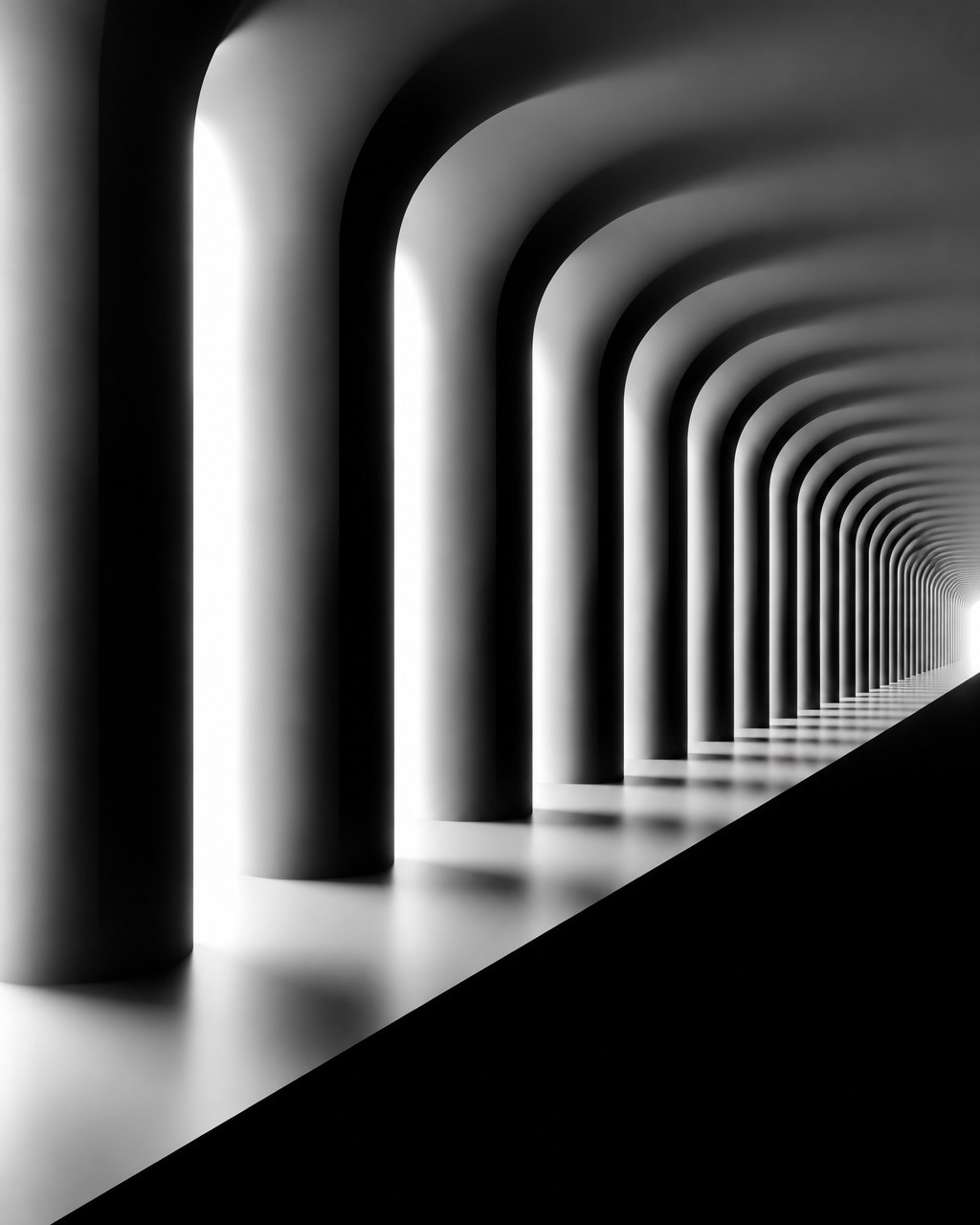
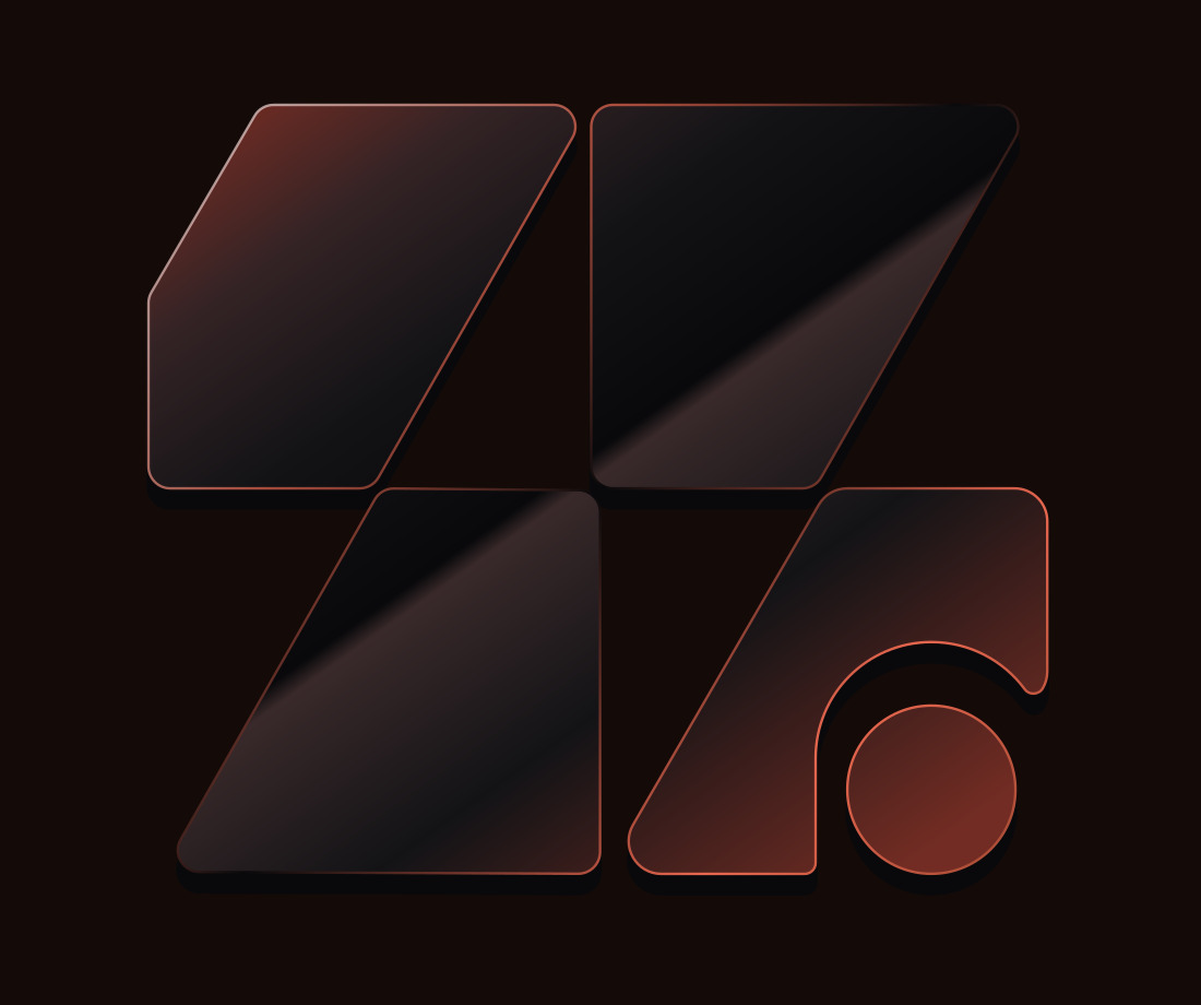
The two image looks of Zuse Group. The mark is always a 3D render of the real logo, never photographed and never made with AI. The architectural texture is a black and white photo, always shown under the warm near-black with its ember-bronze glow.

Sculptural Mark Render, reference 1 of 1
Style 01

Sculptural Mark Render

The hero of the website and other moments where the group itself is the subject: presentation covers, social headers, launch visuals. One mark per image. Not for the individual companies, which keep their own identity.

The look

A 3D render of the Zuse Group mark as a physical object: the four slanted panels and the round dot of the logo, built as thick slabs of dark smoked glass (#09090b to #131316) with softly rounded edges. Each panel carries one clean diagonal reflection band. The edges are lit from behind in bronze and copper (#c17f62, #a64b35), so every outline glows thin and warm while the faces stay dark. The dot is solid copper. The object floats in a deep ember glow (#722c23 fading to #09090b), seen straight on or with a slight tilt, with a soft shadow under it. Calm, premium, sculptural. Always a 3D render of the real logo geometry, built from the logo file. Never generated with AI, never photographed, never redrawn by hand.

Avoid

changing the shape or proportions of the mark, extra panels, chrome or gold, rainbow reflections, busy backgrounds, text.
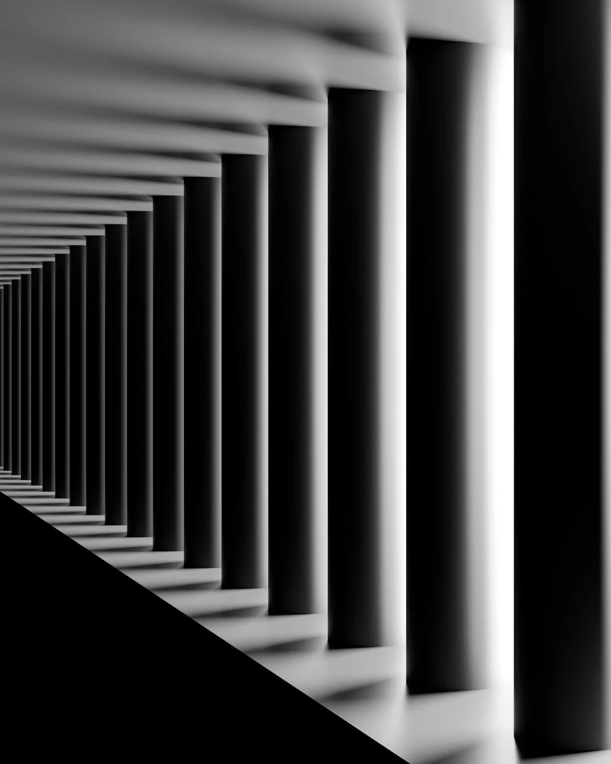
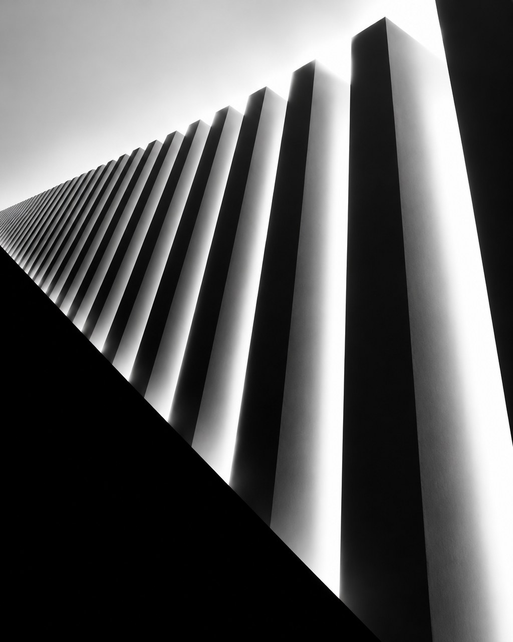
Monochrome Architectural Rhythm, reference 1 of 3
Style 02

Monochrome Architectural Rhythm

Background texture behind the closing card and sections that have no image of their own. It should read as depth, never as a photograph. Shown at 3 percent under a warm near-black (#0e0b0b), with a dark ember-bronze glow (#7a2410 at 9 percent) falling in from the top; apply after generating, never in the prompt.

The look

Abstract architectural photography in pure black and white, no colour at all and no people. A single repeating architectural element (columns, fins, beams, louvres, arches) recedes in strong perspective toward a vanishing point, creating rhythm. Hard pure-black solids against bright, high-key, glowing white light; at least a third of the frame is near-white. Highlights bloom and bleed softly, with a slightly blurred, long-exposure softness in the light falloff. One bold, razor-sharp geometric black shadow plane cuts diagonally across part of the frame. Extreme contrast: pure #000 blacks and clean white, smooth grey gradients only in the light transitions. Minimal, sculptural, quiet, almost graphic. Vary the structure and viewpoint between images (looking up a facade, down a tunnel, along a colonnade).

Avoid

people, colour or a warm cast, film grain, visible material texture, busy detail, text, logos.

Need help implementing this brand?

Oh Lord

We create almighty brands.